


Contents are the most important components of a blog. On the other hand, the layout serves as its face. The blog design is the presentation of the blog's content. With bad presentation, your blog sure serves some unsightly impression.
The Blog Design Team was launched just last January 2011. They do logo design services, mascot design, banner design, ecover design, and other design services upon request.
But before anything else, since this is about blog design, let's check if the site itself will pass our standards of a good design.

When I landed at the home page, I immediately noticed something.


To be honest, I find it hard to read the words. First, the font-family used makes it hard to read if you wouldn't look closely. The letters doesn't look normal on this font. Second, the text color used doesn't blend well with the background. Even though there is a drop shadow it's still hard to read because the background has white and has lots of colors.
Second thing I want to point out is their Sitemap page.

I don't know why they put up a Sitemap page if it's not there. It's like - a map that shows the locations of other pages but the location of the map is nowhere to be found.
I also noticed that they used images to describe their services. It's a big no-no if you want your contents to be found by the search engines bots. It's a good practice to always use text.
BDT Services
Though I pointed out some things they forgot about, their portfolio seems to be a good one.
Logo Design
Branding is the most essential part when starting up a business or introducing an entity into its target audience. That's why a good logo is important before anything else. If you have seen my review of The Bad Blogger, you would see on the discussions how my readers love The Bad Blogger's logo. Making a kickass logo will definitely pull your audience closer to you.
Mascot Design
Do you know JarGon? It's that robot mascot from SEOmoz! Putting up mascots is a good way to add fun to the reading experience of your visitors. It's like there's someone accompanying them around the site. Do you have a favorite mascot you found on the web? Share it with us!
Banner Design
Second to the header, banners are also the eye-catching elements on a blog. It could be an ad banner, a poster, an infographic, whatever. It's better that those which catches the eyes are the good ones. Bad banners lead to bad reputation.
Ecover Design
Ebooks are spreading like a wildfire these days. Almost every blog out there feeds you with a free ebook upon subscription, it is important that though we cannot hold them physically, they possess a good ecover. We may never judge a book by its cover, but we get the first impression from it.
You can also read cool stuff on their blog, but the last post was way back April 2011. I think they need a little update there.
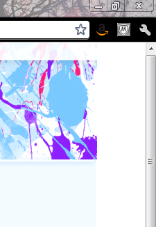
When designing for a layout, it is indeed one of the challenges to be able to come up with a design that's fit for any screen resolution. It could be that while designing their header, their computer screen is a bit smaller than mine that's why it doesn't fit throughout the x-coordinates. Since their header design looks like a splatter of paints, it's not appropriate to repeat-x the header image as it wouldn't look nice.
Regarding their header...
Regarding their header...
To be honest, I find it hard to read the words. First, the font-family used makes it hard to read if you wouldn't look closely. The letters doesn't look normal on this font. Second, the text color used doesn't blend well with the background. Even though there is a drop shadow it's still hard to read because the background has white and has lots of colors.
Second thing I want to point out is their Sitemap page.

I don't know why they put up a Sitemap page if it's not there. It's like - a map that shows the locations of other pages but the location of the map is nowhere to be found.
I also noticed that they used images to describe their services. It's a big no-no if you want your contents to be found by the search engines bots. It's a good practice to always use text.
BDT Services
Though I pointed out some things they forgot about, their portfolio seems to be a good one.
Logo Design
Branding is the most essential part when starting up a business or introducing an entity into its target audience. That's why a good logo is important before anything else. If you have seen my review of The Bad Blogger, you would see on the discussions how my readers love The Bad Blogger's logo. Making a kickass logo will definitely pull your audience closer to you.
Mascot Design
Do you know JarGon? It's that robot mascot from SEOmoz! Putting up mascots is a good way to add fun to the reading experience of your visitors. It's like there's someone accompanying them around the site. Do you have a favorite mascot you found on the web? Share it with us!
Banner Design
Second to the header, banners are also the eye-catching elements on a blog. It could be an ad banner, a poster, an infographic, whatever. It's better that those which catches the eyes are the good ones. Bad banners lead to bad reputation.
Ecover Design
Ebooks are spreading like a wildfire these days. Almost every blog out there feeds you with a free ebook upon subscription, it is important that though we cannot hold them physically, they possess a good ecover. We may never judge a book by its cover, but we get the first impression from it.
You can also read cool stuff on their blog, but the last post was way back April 2011. I think they need a little update there.
Visit blogdesignteam.com.
Follow BlogDesignTeam on Twitter:
This post is a part of
BlogFest 2011 hosted by Loading-Info and
the June 2011 Contest of BlogEngage.
BlogFest 2011 hosted by Loading-Info and
the June 2011 Contest of BlogEngage.
If you want to share:


0 Switch to the Web version to comment:
Post a Comment